A picture is worth a thousand words but is a fuzzy picture worth any words at all?
Unless an editor is also a photographer or production staff, the only time they are likely to run into image resolution details is when previewing an image or making an image request. The more dots/pixels there are per cm, the sharper an image looks. But the more dots there are, the more it costs to print that image (and maybe to buy it, too) and the longer it will take to load in the ebook reader, app, or website. The sweet spot is procuring the lowest resolution that will fit the purpose!
DPI vs PPI
Resolution is a term used to describe the number of dots or pixels in an image; it relates to how clear and sharp the image looks. Pixels per inch (ppi) is the measure used when describing images displayed on a screen; screens are made of pixels. Dots per inch (dpi) is the measure used for images printed with ink ok paper. Literally, it’s a measure of the number of ink dots per inch in the printed image. Like the tech version of a pointillist painting technique, you can see those dots by holding a magnifier up to any image on paper.
You won’t see dots on photographs printed in a photo lab because those are made from light-reactive paper rather than ink. Pixels are basically the electronic dots that make up an image on screen. In practice, dpi and ppi are used interchangeably.
Ideal Resolution for Print Images
Printed images should come from files that have a resolution of at least 300 dpi or they are not likely to look clear. The size of the image file depends on how big the final image will be because there are 300 dots in each linear inch in the photo: 90,000 dots per square inch. So a 1 MB photo might have too few dot details to be printed on a large poster, for example.
Ideal Resolution for Screen Images
Images destined for screen display should have at least 190 ppi. In the early days of the World Wide Web, 72 dpi was the standard resolution for images. It meant that images were clear and file sizes were as small as possible to make downloading fast. But with today’s UHD, 4K, and Retina screens, users will notice a loss of clarity in images with less detail than 190 ppi.
The lower resolution that looks good onscreen explains why images taken from a website (especially logos and other graphics) look so bad when printed—like the image on this post would.
Unlike images destined for print, we can’t know whether the picture will be displayed on a palm-sized phone or on a big-screen TV. Having an idea of how your ideal audience member will view the final work matters!
How to Find the Resolution
Now that you know what to look for, you need to know where to find the information. When selecting an image from a stock catalogue or image producer, look for the resolution or size details in the catalogue entry.
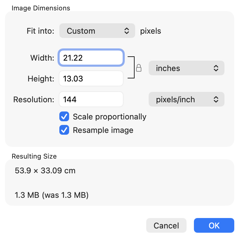
With the image file in hand, you can check the properties of the file itself. In an image viewing application like Mac’s Preview or Windows’ Image Viewer, look for a tool such as “adjust size” (shown at right). Editors typically don’t change images, but doing a quality check is part of several editorial roles along the production line!
Photo by Pixabay, used under CC0 license. A version of this post was originally published on the now-defunt Copyediting.com.